Case study · AiThrive Studio
Building our own brand first
Before we asked anyone to trust us with their brand, we built ours.
The brief
A new company with two founders, two core services and no visual identity. It needed to look trustworthy to a small business owner at first glance.
What we made
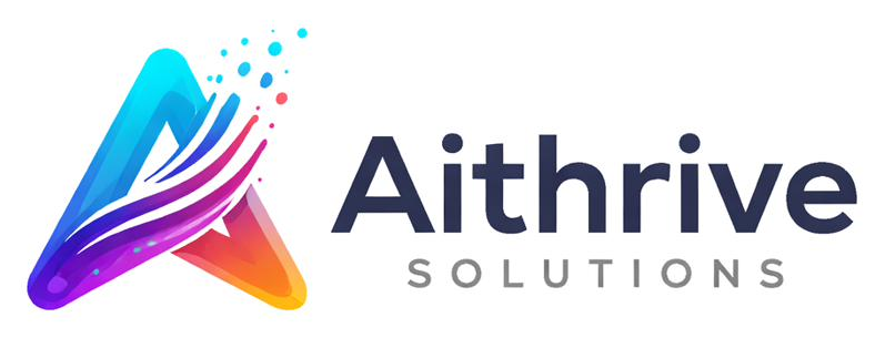
Logo v3: an "A" built from flowing ribbons, with particles lifting off. Momentum and growth. Six core colours, two typefaces, a 15-page brand guide and this website.
Typography
Poppins
Headlines
Inter
Body text and labels
Six core colours
Primary Blue
#2D6CDF
Purple Accent
#6A5BFF
Teal Highlight
#00C2C7
Accent Orange
#FF7A18
Dark Text
#1A1A1A
Background
#FFFFFF
How we worked
We used AI tools for the production work: exploring directions, generating variations, drafting layouts. Every choice that mattered (the final mark, the colours, the words) was made and checked by us.
What's next
Tell us about your business
20 minutes, no obligation. You'll leave with at least one idea you can use this week, whether or not we work together.
Book a 20-minute call